Summer/Spring 2024
Autumn/Winter 2023
EYEWEAR GETS A FACELIFT WITH THRILLING PANTONE COLOURS AND LUXE NEW STYLES
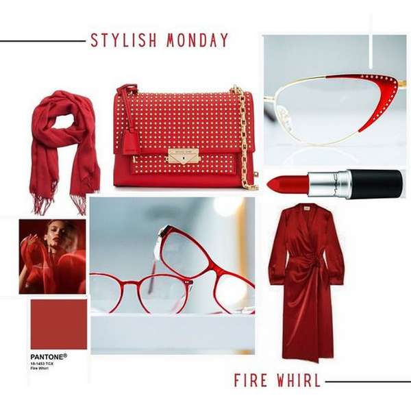
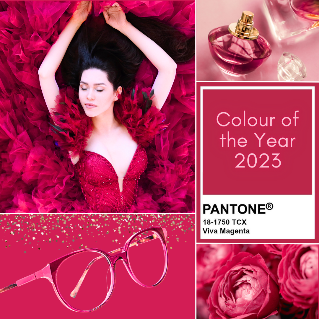
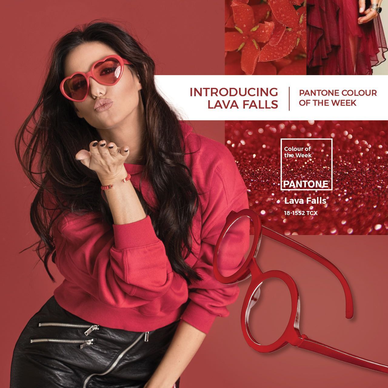
Pantone has designated ‘Viva Magenta’ as their ‘Colour of the Year’ for 2023, which is a vibrant reddish-pink hue that they describe as “an unconventional red for an unconventional time”. The colour is intended to unite individuals of all backgrounds who possess a zest for life and a rebellious spirit, according to Pantone, and it is daring, clever, and comprehensive.
Pantone claims that, in the midst of the technology era, they seek to derive inspiration from nature and the authentic world. Pantone 18-1750 Viva Magenta is derived from the red family and inspired by cochineal red, which is one of the most valuable dyes in the natural dye family and among the most robust and brightest colours known to man.
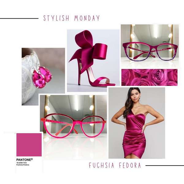
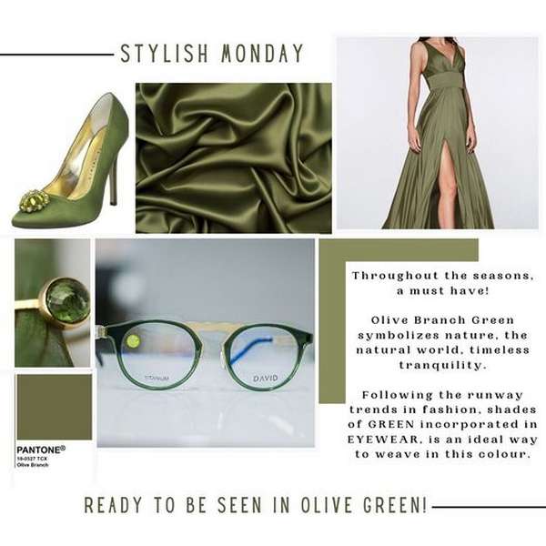
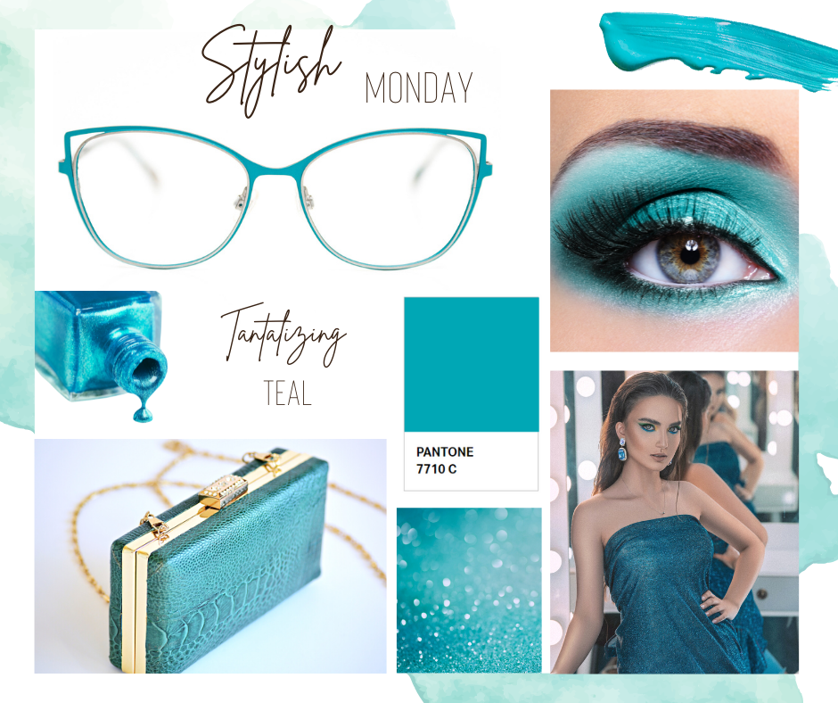
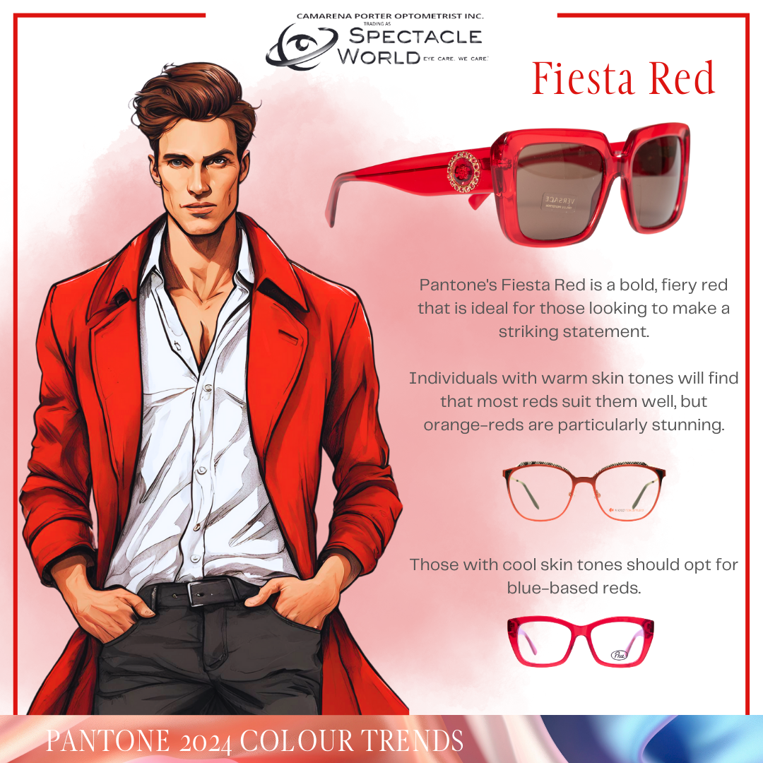
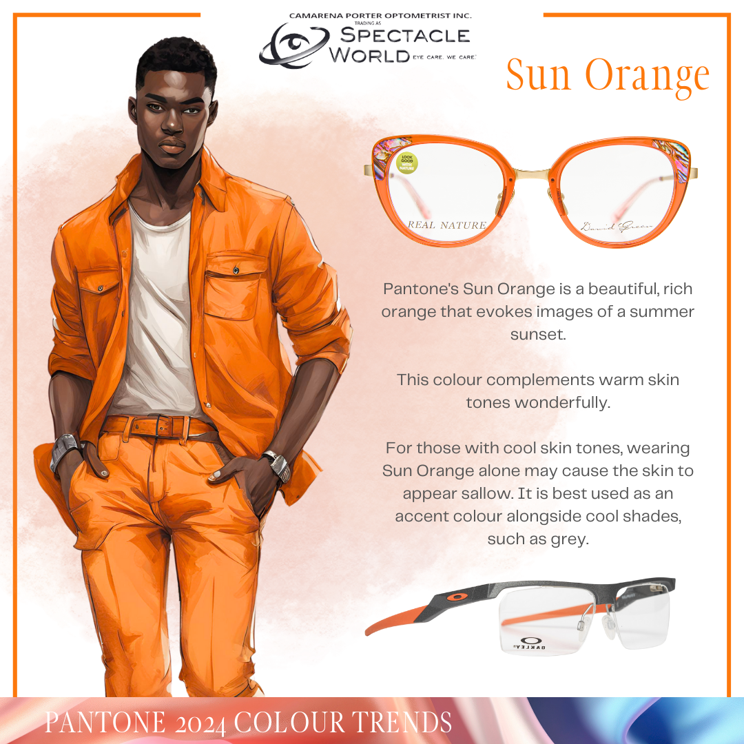
Says Adele Camarena, owner and director at Spectacle World: “We’re excited about the new colours for frames this year. Bright shades of fuchsia and neon pink have already established themselves successfully in the eyewear sector, but we also look forward to colours such as Robin’s Eggs Blue, Lavender, Every Shade of Unconventional Blue, Pastel Pink, Teal, Blood Orange and Green for summer.”
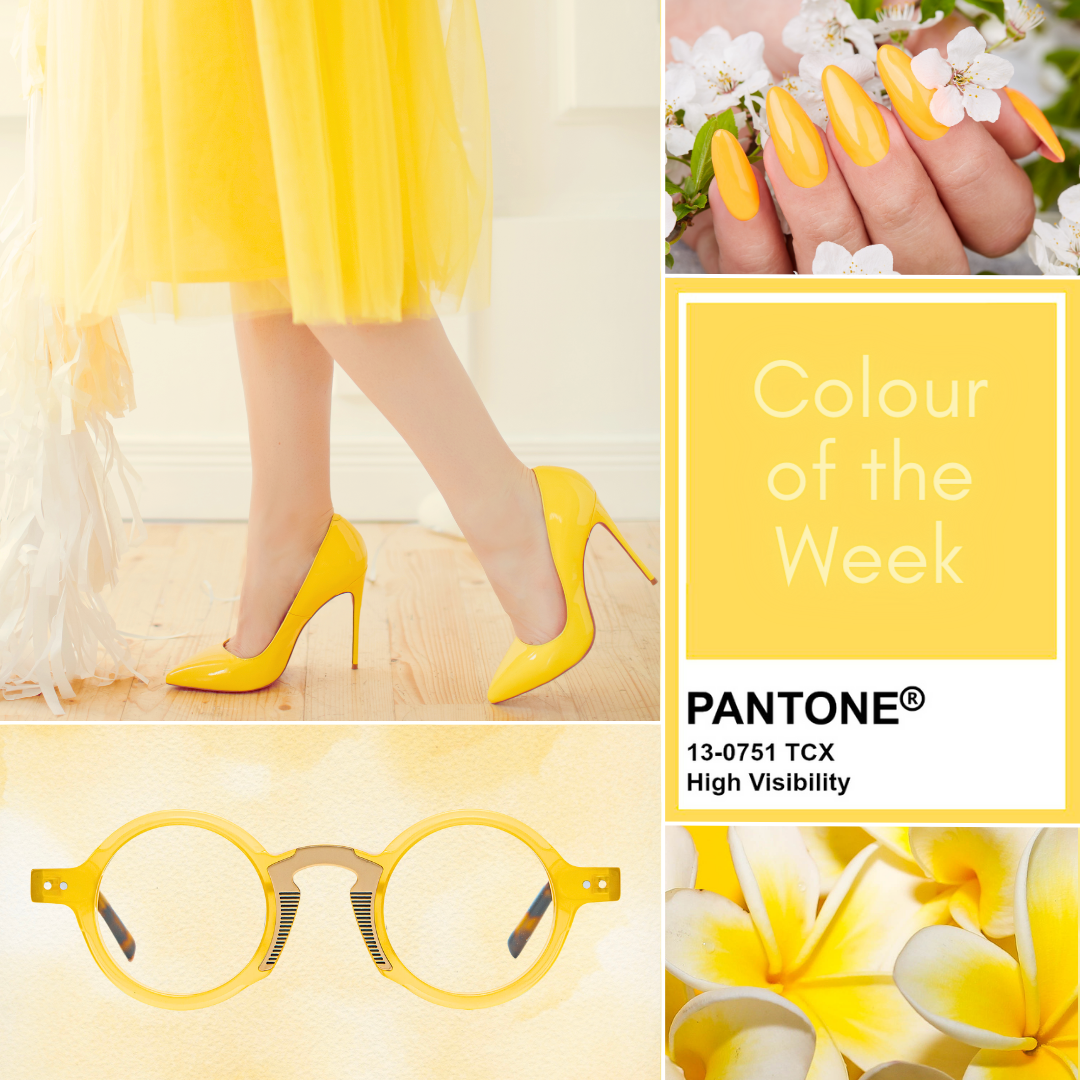
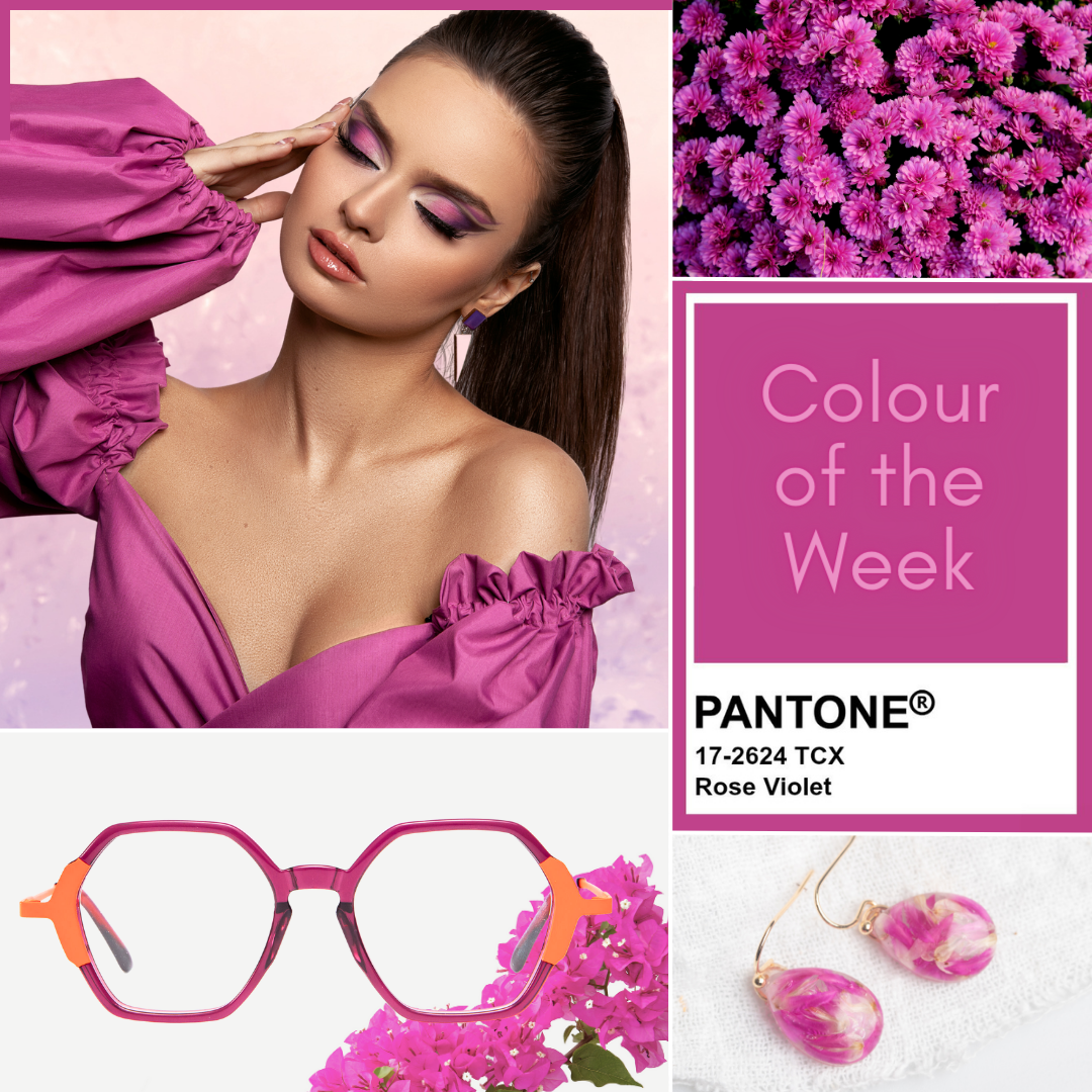
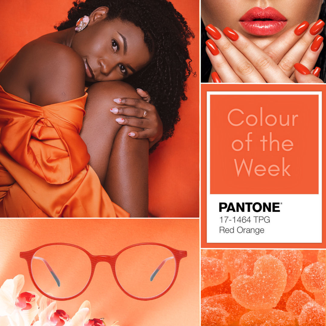
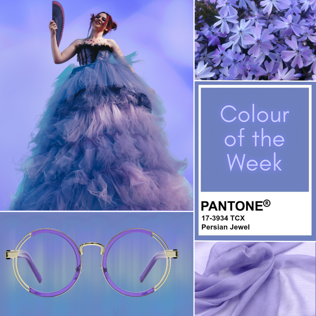
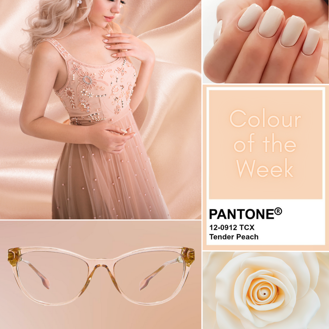
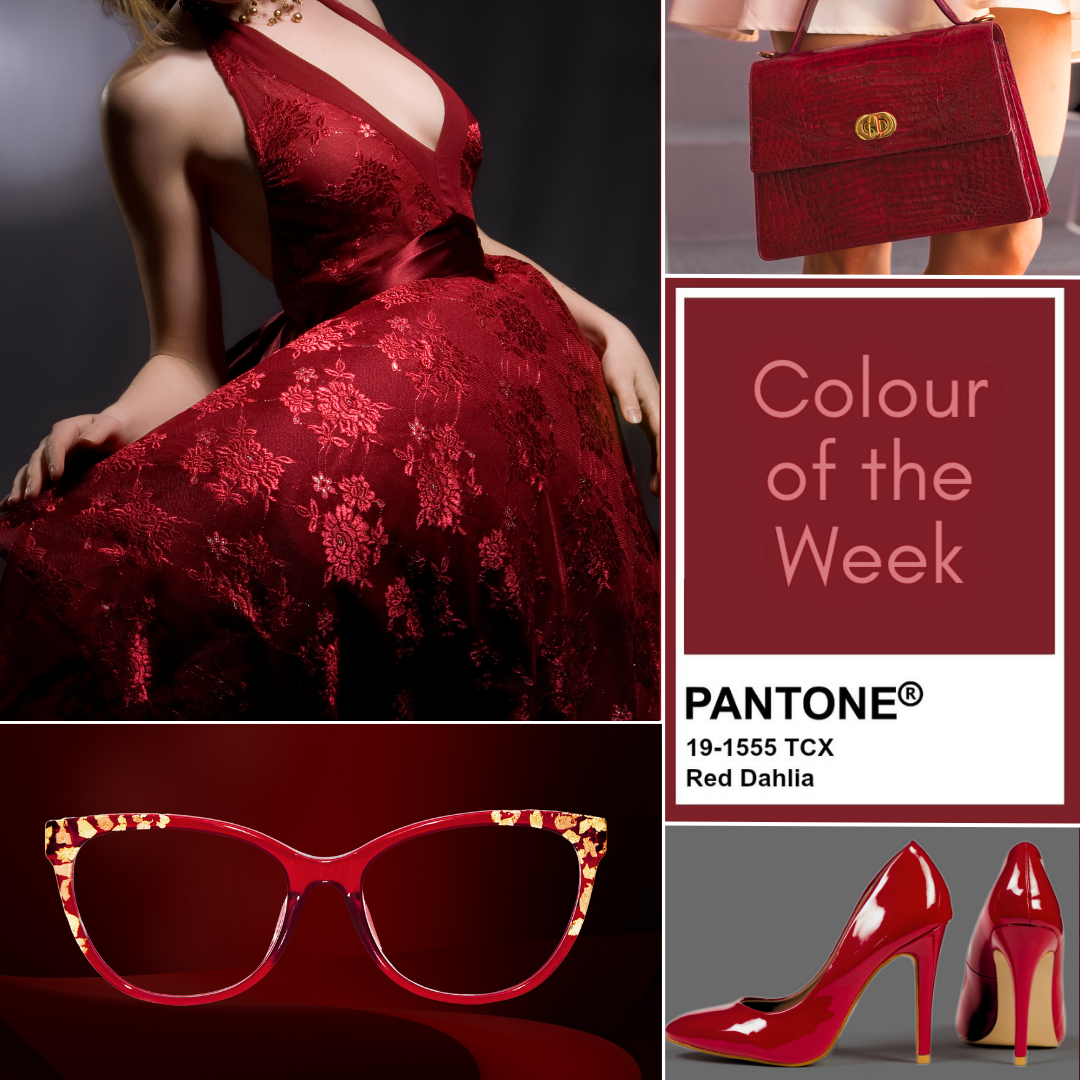
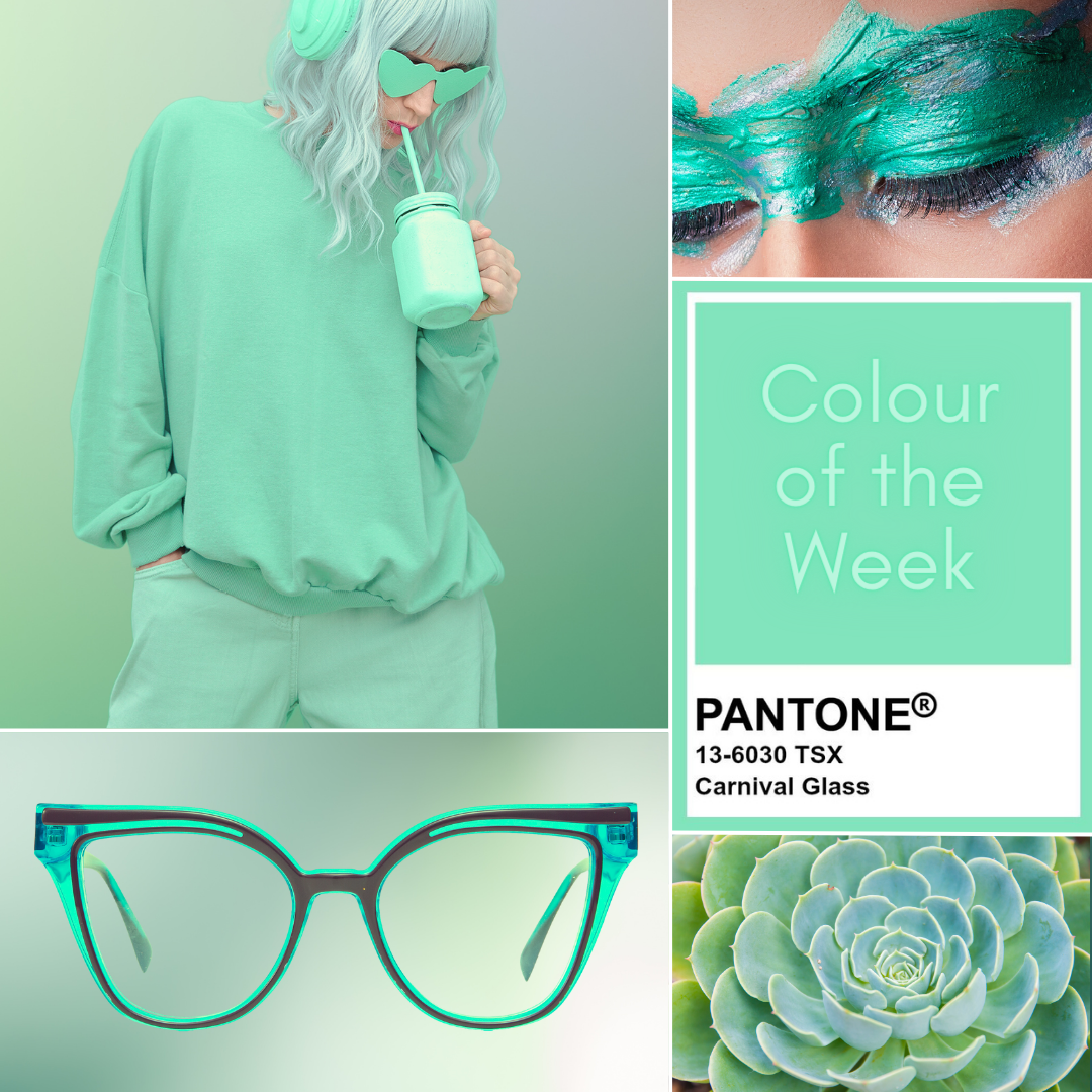
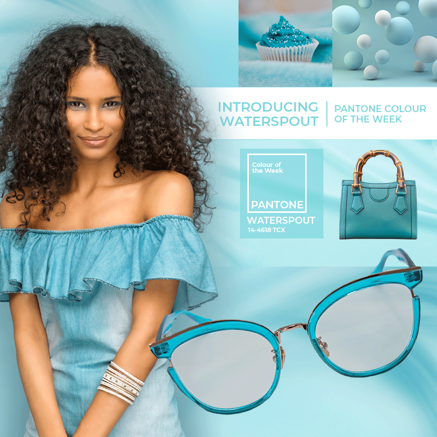
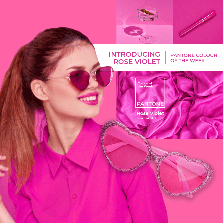
Pantone’s winter colours include Rose Violet, Tender Peach, Red Orange, Red Dahlia, High Visibility, Persian Jewel, Carnival Glass, Burnt Sienna and Kohlrabi.
Camerena adds that switching from your regular black or tortoiseshell to a striking pair may be intimidating, but is a quick and easy way to update your look. “If you’re not quite ready for the blood orange, look at pastels or jewel-inspired hues such as emerald green or deep red. These colours are the perfect start if you want to experiment.
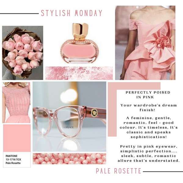
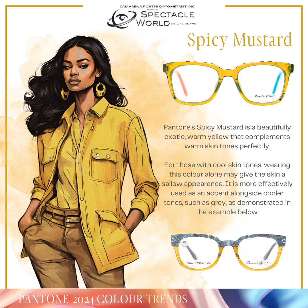
“Pastels have a refreshing, soothing, and calming effect, making them a prevalent choice. This soft palette is effortlessly paired with deeper, more subdued hues, creating a balanced aesthetic that makes colour easy to incorporate into your everyday look. Pastels with warm undertones will continue to gain popularity as they complement lighter hair and skin tones, imparting a warm glow.”
The eyeglasses trend for invisible frames has been gaining momentum as a fashionable alternative for years to come. “Clear acetate frames are in vogue, making them a popular choice. On the other hand, stronger, deeper, and brighter colours convey energy, joy, and optimism. They exude confidence and are perfect for those with deep, warm, and clear complexions. We’re also seeing many combinations of colours in one frame, including blues, browns, pinks, and yellows. It’s another subtle way of introducing colour, but more daring than pastels on their own,” she says.
Camarena continues that they offer a wide variety of frames to suit everyone. “While specs follow trends just like clothing does, picking the perfect pair can be difficult. Eyewear is the most personal accessory, and the first thing people see. Under the guidance of an eyewear stylist, you can select the perfect frame and colour from this season’s ranges to complement your features, colouring, as well as style personality and get the perfect fit. Eyewear is, and will remain, the epitome of fashion and function.”
Camarena and her team are qualified eyewear consultants, having completed courses presented by the Eyewear Styling Academy.
Autumn/Winter 2022
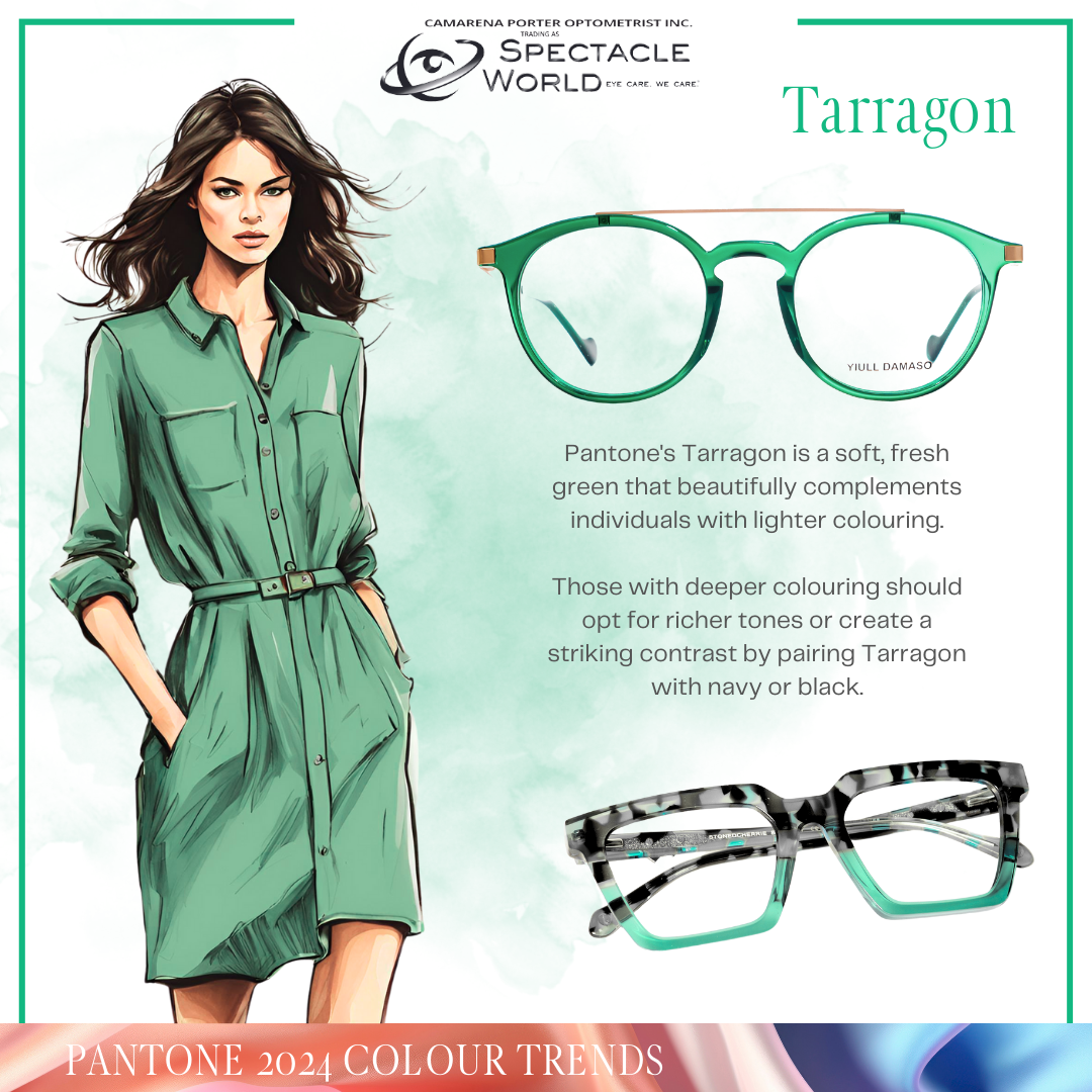
Fashion Pantone colours Autumn/Winter 2022/2023, highlight the moments from uncertainty to peaceful moments. It merges and focuses on nature /environment, with our craving for serenity and wellbeing through the light-infused pastels. The pastel colours complement your lights and cool and soft complexions beautifully.
The stronger, deeper and brighter colours are loaded with energy, with a message of joy and optimism, and celebrate the now, by making a statement in the present. Your deep, warm and clear complexion will walk with a statement of confidence.
“As we look to the future, we see two emerging paths that while completely diverse, are inevitably interconnected,” said Leatrice Eiseman, Executive Director of the Pantone Color Institute. “This intense dichotomy comes through in our colour choices for Autumn/Winter 2022/2023 where we see bold and brash colours that lend themselves to exaggerated statements reflecting our desire to embrace life with full vigour, coalescing with an array of neutral and natural tones that embody a sense of calm and containment and satisfy our need for harmony and tranquillity.”
The Summer /Spring Fashion Pantone Colours 2021
The Spring/Summer 2021 palette is filled with beautiful colours that reflect hope and optimism, emphasising our deep desire for the pleasure and enjoyment colour can bring to our lives.
This season we are starting to see eyewear designs and colour combinations which are more creative and bolder than ever before!
As noticed in history, individuals are in times of great global stress, more creative and push for a new normal. In 2020 most people worked from home and use digital screens to communicate.
Everybody needs fresh colour in the house, fashion and even eyewear to reflect optimism, opportunity, hope after the stressful global Covid 19 pandemic year.